R Workshop: Module 4 (2)
Bobae Kang
April 11, 2018

This page contains the notes for the second part of R Workshop Module 4: Data visualization with R, which is part of the R Workshop series prepared by ICJIA Research Analyst Bobae Kang to enable and encourage ICJIA researchers to take advantage of R, a statistical programming language that is one of the most powerful modern research tools.
Links
Click here to go to the workshop home page.
Click here to go to the workshop Modules page.
Click here to view the accompanying slides for Module 4, Part 2.
Navigate to the other workshop materials:
Data visualization with R (2): Maps and interactive plots
In the previous part, we studied the basic plotting with ggplot2. In this part, we will explore some options for creating maps and interactive plots.
Maps
A lot of criminal justice datasets are geospatial, i.e., they are often collected on a certain geographical unit. In cases like this, maps offer a excellent way to visualize geographical distribution of certin attributes and trends.
In this section, we begin with learning one of the most popular geospatial data format called shapefile. Then we will touch on how to import shapefile data into R using rgdal pakage, an R interface to Geospatial Data Abstraction Library (GDAL) for reading and writing geospatial data formats. Then we will take a quick look at spatial data types in R.
Shapefile
In practice, a lot of geosaptial datasets we work with come in the shapefile format. So, what is shapefile? The following two quotes offer brief answers to the question:
“A shapefile is a simple, nontopological format for storing the geometric location and attribute information of geographic features. Geographic features in a shapefile can be represented by points, lines, or polygons (areas).”
- “What is a shapefile?”, Esri
“The shapefile format is a popular geospatial vector data format for geographic information system (GIS) software […] developed and regulated by Esri […]. The shapefile format can spatially describe vector features: points, lines, and polygons […]. Each item usually has attributes that describe it, such as name or temperature.” - “Shapefile”, Wikipedia
Shapefile components
A shapefile format in fact consists of a collection of files. The following are commonly included when using shapefile data in R:
| File extension | Description |
|---|---|
.shp |
The main file that stores the feature geometry; required. |
.shx |
The index file that stores the index of the feature geometry; required. |
.dbf |
The dBASE table that stores the attribute information of features; required. |
.prj |
The file that stores the coordinate system information; used by ArcGIS. |
Importing a shapefile
library(rgdal)
spatial_object <- readORG(dsn, layer)
# example:
# il_counties <- read(dsn = "shapefiles", layer = "il_counties")In practice, mapping of any kind starts with importing an existing shapefile into the R environment. The rgdal package offers the readORG() function for this work.
dsn is the path to the directory with a shapefile to import, and layer is the name of a shapefile to import. The output is a spatial vector object.
Spatial (vector) objects in R
There are multiple spatial vector object types provided by the sp package.
Spatial* classes are those without attributes other than spatial ones (coordinates, lines, etc.). There are SpatialPoints, SpatialMultiPoints, SpatialPixels, SpatialGrid, `SpatialLines, and SpatialPolygons.
Spatial*DataFrame classes are those with additional attributes in a data.frame table, which can be accesssed using standard methods for accessing data in a data.frame.
- See the “Spatial Cheatsheet” for more one spatial objects in R
Example
class(counties)## [1] "SpatialPolygonsDataFrame"
## attr(,"package")
## [1] "sp"The icjiar package provides a spatial object named counties for countes in Illinois. Using class() function, we find that counties is of the SpatialPolygonsDataFrame class.
Packages for maps
tmappackage for thematic mapsleaftletpackage for interactive maps- And more
tmap: Thematic maps in R
Source: tmap GitHub repo
What is tmap?
“With the tmap package, thematic maps can be generated with great flexibility. The syntax for creating plots is similar to that of ggplot2. The add-on package tmaptools contains tool functions for reading and processing shape files.” - “tmap in a nutshell”
While there are a variety of ways to plot maps using R, in my experience, tmap is the most accessible R package for generating maps, making it easy to get visually appealing maps using data in the shapefile format.
The qtm() function
qtm(shape_object, ...)tmap offers the qtm() function to generate a “quick thematic map”. qtm() is comparable to qplot() in ggplot2 (we didn’t cover qplot() in the previous part; try ?qplot() on your R console to see documenetation).
Although the goal of qtm() is to provide a quick and easy way to generate a tmap object, it offers the same level of flexibility as the main plotting interface using tm_() functions. The main interface is stil recommended for complex plots.
Example
Here is an example of using qtm() to quickly generate a map of Illinois counties, colored by their judicial circuits.
qtm(counties, fill = "circuit")
The tm_*() interface
tm_shape(shape_object) +
tm_*() # add tmap elements as layersThe main interface for tmap to creating maps use tm_*() functions. qtm() is a quick-and-dirty way to create a map and, in fact, is almost as flexible as the tm_*() way. However, as we add more options to tweak our map, qtm() loses its major benefit of simplicity. In constrast, the tm_*() way allows us to organize or code better.
In the tm_*() way, we begin with tm_shape(), which creates a tmap object from a spatial “shape object.” Then we add add layers to it, just as we would do with ggplot2 plotting.
There are three kinds of layers in tmap: two types of “drawing” layers (base and derived) and “attribute” layers.
Base tmap drawing layers
The following table lists tmap’s base drawing layers, with their descriptions and options for aesthetic mappings.
| Layer | Description | Aesthetics |
|---|---|---|
tm_polygons |
Draws polygons | col |
tm_symbols |
Draws symbols | size, col, shape |
tm_lines |
Draws lines | col, lwd |
tm_raster |
Draws a raster | col |
tm_text |
Add text labels | text, size, col |
The table is duplicated from a tmap vignette page
Derived tmap drawing layers
The following table lists tmap's derieved drawing layers, with their descriptions and options for aesthetic mappings.
| Layer | Description | Aesthetics |
|---|---|---|
tm_fill |
Fills the polygons | see tm_polygons |
tm_borders |
Draws polygon borders | none |
tm_bubbles |
Draws bubbles | see tm_symbols |
tm_squares |
Draws squares | see tm_symbols |
tm_dots |
Draws dots | see tm_symbols |
tm_markders |
Draws markers | see tm_symbols and tm_text |
tm_iso |
Draws iso/contour lines | see tm_lines and tm_text |
The table is duplicated from a tmap vignette page
tmap attribute layers
The following table lists tmap’s attribute layers with their descriptions.
| Layer | Description |
|---|---|
tm_grid |
Add coordinate grid lines |
tm_credits |
Add credits text label |
tm_compass |
Add map compass |
tm_scale_bar |
Add scale bar |
The table is duplicated from a tmap vignette page
Example
This example code shows how to create the same map in the tm_*() way.
tm_shape(counties) +
tm_borders() +
tm_fill(col = "circuit")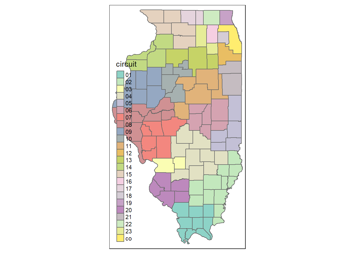
Layouts for maps
tm_layout(title = NA, scale = 1, title.size = 1.3, bg.color = "white", aes.color = c(fill = "grey85", borders = "grey40", symbols = "grey60", dots = "black", lines = "red", text = "black", na = "grey75"), ...)tmap offers tm_layout(), a function to control all the layout settings, including title, fonts, colors, backgrounds, and many more.
Using tm_layout() to tweak layout settings to find the right look can be overwhelming and tedious. As alternatives, there are tm_style_*() functions and tm_format_*() functions to easily apply some predefined layout settings.
More specifically, tm_style_*() functions which offer predefined sets of styling-related layout settings such as background colors, colors and font. This is comparable to ggplot2 themes. On the other hand, tm_format_*() functions which offer predefined sets of position-related layout settings such as margins.
Predefined styles
The following table lists the predefined styles tmap offers and their descriptions.
| Style | Description |
|---|---|
tm_style_white |
White background, commonly used colors (default) |
tm_style_gray |
Gray background, useful to highlight sequential palettes (e.g. in choropleths) |
tm_style_natural |
Emulation of natural view: blue waters and green land |
tm_style_bw |
Greyscale |
tm_style_classic |
Classic styled maps |
tm_style_col_blind |
Style for colorblind viewers |
tm_style_cobalt |
Inspired by latex beamer style cobalt |
tm_style_albatross |
Inspired by latex beamer style albatross |
tm_style_beaver |
Inspired by latex beamer style beaver |
Example
As mentioned before, “style” in tmap is roughly comparable to “theme” in ggplot2. Here is one example of applying a style to the same tmap plot we created above.
tm_shape(counties) +
tm_borders() +
tm_fill(col = "circuit") +
tm_style_classic()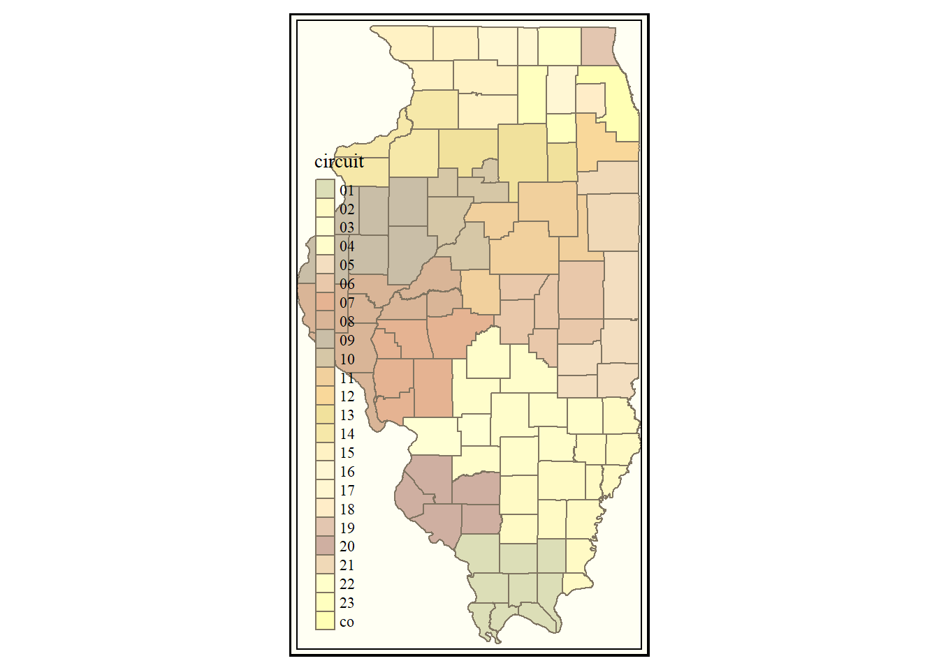
Try out other “styles” and see how they change your map!
Predefined formats
The following table lists the predefined formats tmap offers and their descriptions.
| Format | Description |
|---|---|
tm_format_World |
Format specified for world maps |
tm_format_World_wide |
for world maps with more space for the legend |
tm_format_Europe |
for maps of Europe |
tm_format_Europe_wide |
for maps of Europe with more space for the legend |
tm_format_NLD |
for maps of the Netherlands |
tm_format_NLD_wide |
for maps of the Netherlands with more space for the legend |
Example
“Format” has more to do with the spacing and arrangement of plot elements. Take a look at the following plot with a predefined format. Notice that now the plot is made “wider”.
tm_shape(counties) +
tm_borders() +
tm_fill(col = "circuit") +
tm_format_World_wide()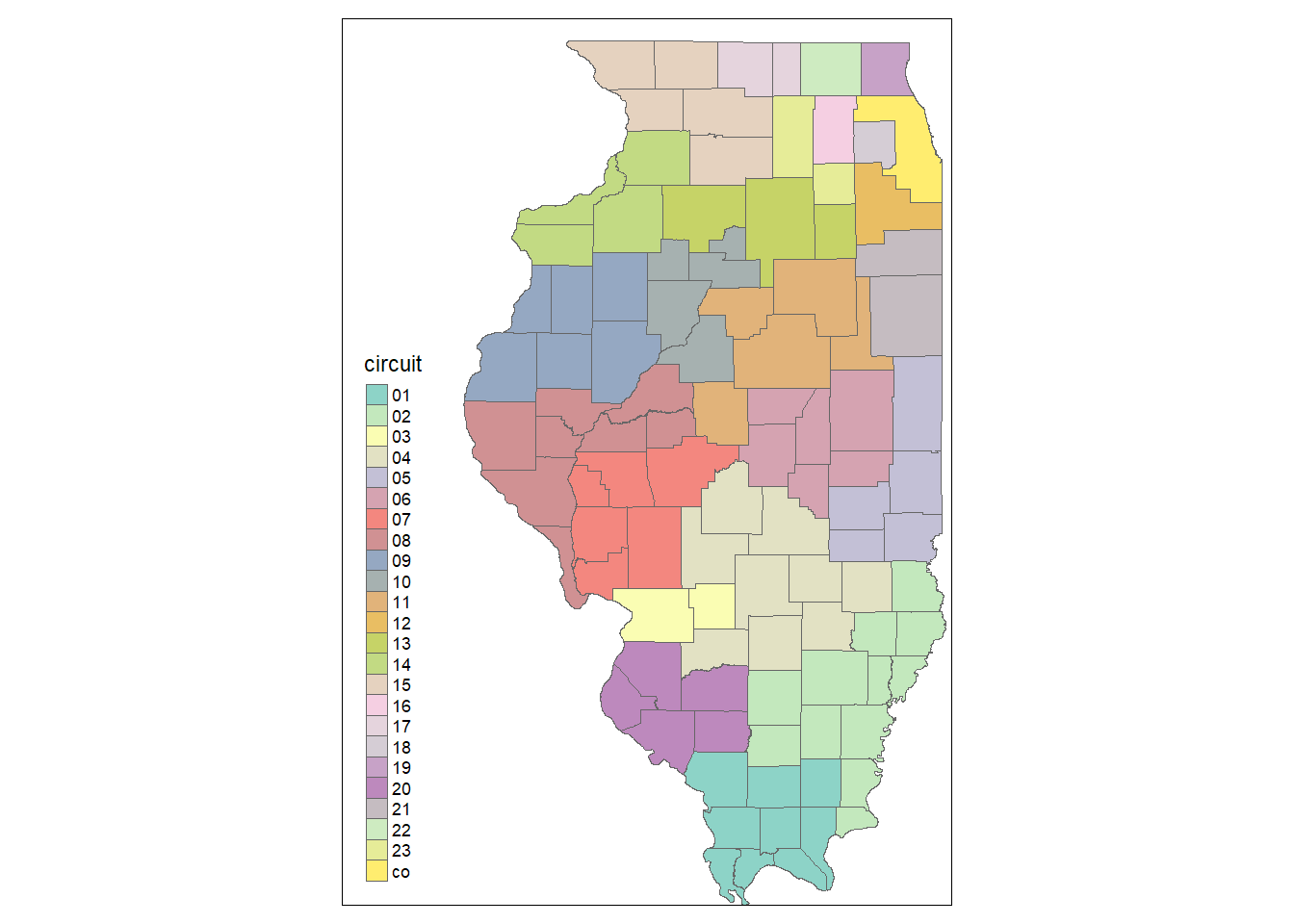
Try out other “formats” and see how they change your map!
Static vs interactive modes
tmap_mode("plot") # set to static "plot" mode
tmap_mode("view") # set to interactive "view" mode
ttmp() # toggle between modestmap offers two different “modes” for generating maps. The “plot” mode generates a static map image, which is the default mode option. On the other hand, the “view” mode generates an interactive leaflet map. We can use tmap_mode() function to set the mode. ttmap() is a shortcut function to toggle between modes. Note that the set mode is applied for all tmap plots generated in that session, untile it is reset.
Additionally, tm_view() is a function to specify options for the interactive “view” mode, some of which can be set with tm_layout().
If we want to create an interactive leaflet map without changing the mode setting for the whole session, we can use tm_leaflet(), which takes a tmap object as the argument input.
Example
Here we try the simple qmap() we saw ealier in the interactive view mode. the default option comes with many useful features, including on-click tooltips (try click anywhere on the Illinois map) and an option for changing base maps (try hover your mouse pointer over the button below the zoom buttons).
tmap_mode("view")
qtm(counties, fill = "circuit")Leaflet

Source: leafletjs.com
What is leaflet?
“Leaflet is one of the most popular open-source JavaScript libraries for interactive maps. It’s used by websites ranging from The New York Times and The Washington Post to GitHub and Flickr, as well as GIS specialists like OpenStreetMap, Mapbox, and CartoDB.”
-“Leaflet for R”, RStudio
leaflet is a powerful library for generating interactive maps, perhaps one of the most powerful options that are freely available.
However, it takes much time and practice to get familiar with its API–even using R. There is no function in leaflet that is equivalent to qtm() and quickly generates a map with default settings. That said, using tmap’s interactive view could be a great alterantive to using leaflet’s API directly.
Nonetheless, if you are serious about creating some beautiful interactive maps, it certainly pays to learn leaflet.
Example
The following example creates a simple leaftlet map. Note that you have to pretty much define everything you want to see on your map. On one hand, leaflet provides a great degree of flexibility; on the other hand, it takes many more lines of code to get a relatively simple output.
pal <- colorFactor(topo.colors(5), counties$circuit)
leaflet(counties) %>%
addProviderTiles("CartoDB.Positron") %>%
addPolygons(fillColor = ~pal(circuit), color = "darkgrey", weight = 2) %>%
addLegend(pal = pal, values = ~circuit)Other options
- Base R plot is capable of draw a simple map from a spatial object. However, anything more than a simple plotting of borders is better handled with third-party packages.
- The
sppackage offersspplot(), which builds on the base R plot functionality.spplot()takes an object of spatial classes as its source data, making it easy to work with imported shapefiles (See Eubank, N. (2015) in Resources for more). ggplot2can usegeom_polygon()and/orgeom_map()to plot spatial polygons with some modificiations (See Kahle, D. & Wickham, H. (2013) in Resources for more).ggmapis an R package offering functions to easily downlaod base maps from various sources, which can be used withggplot2layers (See Kahle, D. & Wickham, H. (2013) in Resources orggmapgithub repo for more).
Resources
Here are some resources on drawing maps in R. I strongly recommand you to read through the tmap vignettes to get started with generating good-looking maps with tmap.
Also, if you are interested in digging deeper into spatial data manipulation in R based on the sp package’s spatial classes, make sure you check out an online manual/book by Hijmans (2016).
Finally, a new paradigm for working with spatial objects in R has recently emerged and is implemented by the sf package. To learn more about sf, take a look at Pebesma (n.d.) and the package vignettes listed on the webpage.
- Eubank, N. (2015). “Making maps in R”.
- Hijmans, R. (2016). “Spatial Data Manipulation”. R Spatial.
leaftletofficial documentation page- Lovelace, R. et al. (2017). “Introduction to visualising spatial data in R”.
- Pebesma, E. (n.d.). Simple Features for R.
tmapgithub repository
Interactive Plots

Source: Wikipedia Commons
More compelling visualizations can be created with incorporating interactivity. We have already seen some interactive plots with tmap view mode and leaflet. Here we will explore some options for creating plots in general with some interactive features. Please note that this section is not meant to serve as a comprehensive or exhaustive manual for any of the introduced packages.
Packages for interactive plots
ggiraph: anhtmlwidgetpackage for interactiveggplot2graphicsplotly: R API for the plotly.js libraryhighcharter: R API for the highchart.js library- And more
ggiraph
Source: ggiraph documentation page
What is ggiraph?
“ggiraph is an htmlwidget and a ggplot2 extension. It allows ggplot graphics to be animated.”
- Gohel, D. (package author/creator)
ggiraph offers interactive geoms to be used for a ggplot2 plot and renders the plot with interactive geoms as an interactive visualization.
Interactive “geom” layers
p <- plot + geom_*_interactive(...)
ggiraph(code = print(p), ...)To add interactivity to ggplot2 plot with ggiraph, we first need to create a ggplot object (plot in the code chunk above) with interactive “geom” layers. The ggiraph() function than uses the ggplot object with interactive layers to generate an interactive plot.
ggiraph offers 12 interactive “geom” layers that can be integrated into a ggplot object, including the following:
geom_bar_interactive,geom_boxplot_interactive,geom_histogram_interactive,geom_line_interactive,geom_map_interactive,geom_path_interactive,geom_point_interactive,geom_polygon_interactive,geom_rect_interactive,geom_segment_interactive,geom_text_interactive, andgeom_tile_interactive.
Interactive aesthetic mappings
aes(tooltip, onclick, data_id)Each interactive “geom” has mapping for the following interactive elements:
tooltipis a column containing information to be displayed as tooltiponclickis a column containing JavaScript instructions to run for a “click” eventdata_idis a column containing id to be associated with elements. Please note that this mapping must be specified to use a customized “hover” effect.
Example
First we get the data we will use, which is a filtered subset of ispcrime dataset joined with regions dataset.
data <- ispcrime %>% filter(county != "Cook") %>% left_join(regions)Since ggiraph requires a ggplot object to convert into an interactive, we create one. Note that we use geom_point_interactive() layer, instead of ggplot2’s native geom_point().
p <- ggplot(data, aes(x = violentCrime, propertyCrime, color = region)) +
geom_point_interactive(aes(tooltip = county, data_id = county))Now we can plug the plot into ggiraph() to make it an interactive plot. This example has hover_css argument input for specifying the hover effect.
ggiraph(code = print(p), hover_css = "fill:orange; fill-opacity:.3; cursor:pointer;")plotly
Source: wikimedia.org
What is plotly?
“Plotly’s R graphing library makes interactive, publication-quality graphs online. Examples of how to make line plots, scatter plots, area charts, bar charts, error bars, box plots, histograms, heatmaps, subplots, multiple-axes, and 3D (WebGL based) charts.”
- “Plotly R Library”, plotly
The ggplotly() function
ggplotly(p = ggplot2::last_plot(), ...)plotly offers the ggplotly() function as a quick and easy way to convert a ggplot object into an interactive plotly object.
The first argument of ggplotly(), p, is a ggplot2’s ggplot object to be made interactive. The default value for p is the most recently created ggplot object if ther is any.
Example
We use the same subset of ispcrime we created earlier to try out ggplotly. As in the case of using ggiraphy, we than create a ggplot object, but without using any special layer.
# using the same data
p <- ggplot(data, aes(violentCrime, propertyCrime, colour = region)) +
geom_point() + labs(title = "Using ggplotly()")We then simply plug the ordinary ggplot object into ggplotly() to get an interactive plot with some nice default features. These features include tooltips, an ability to zoom in and out, an option to download the plot as a static image, and many more.
ggplotly(p)Try the interactive features of this plot to understand them better.
The plot_ly() interface
plot_ly(data, x, y, color, alpha, symbol, size, ...)
# equivalent to add_type()
add_trace(p, ..., type = "type", inheret = TRUE)Using the plot_ly() function, we can create a native plotly visualization. First, we use plot_ly(), which takes a data frame and defines the aesthetic mappings. Then we add “traces” to the plotly object, which are comparable to “geom” layers in ggplot2.
In fact, we can specify traces within the plot_ly() function. However, using add_trace() and its variants make it possible to use a dplyr-style workflow with pipe operators and better organize the code. By default, each trace added using add_trace() inherits the mappings from p.
plotly add_ functions
plotly offers various traces to use. The following table lists some add_ functions and their descriptions.
| Function | Description | Equivalent to add_trace(...) |
|---|---|---|
add_trace() |
add traces with options | NA |
add_markers() |
adds a scattorplot | type="scatter", mode="markers" |
add_lines() |
adds a line plot | type="scatter", mode="lines" |
add_bars() |
adds a bar plot | type="bar", mode="markers" |
add_histogram() |
adds a histogram | type="histogram" |
add_boxplot() |
adds a box plot | type="box" |
add_pie() |
adds a pie chart | type="", mode="" |
add_text() |
adds texts | |
add_polygons() |
adds polygons | type="", mode="" |
Example
The following code uses the plot_ly() interface to replicate the plot we created above. Here we use add_markers() for generating a scattorplot. The output is a plot with a native plotly layout.
plot_ly(data, x = ~violentCrime, y = ~propertyCrime, color = ~region) %>%
add_markers() %>%
layout(title = "Using plot_ly() interface")highcharter
Source: highcharter github repo (jbkunst/highcharter)
What is highcharter?
“Highcharter is a R wrapper for Highcharts javascript libray and its modules. Highcharts is very mature and flexible javascript charting library and it has a great and powerful API.”
-Kunst, J. (package author)
Highcharts is one of my favorite JavaScript visualization library that offers elegant plots with interactive features. In fact, you may have already seen Highcharts plots in ICJIA R&A Unit’s online articles (e.g. Figure 1 and Figure 2 in this article).
The hchart() function
hchart(data, type, hcaes(x, y, ...))highcharter offers the hchart() function to quickly generates a hichchart plot, which is comparable to qplot() in ggplot2. type defines the type of plot (e.g. “scattor” for scattorplot), and hcaes() works like aes() in ggplot2 to define aesthetic mappings.
Example
The following example uses hchart() to quickly generate the same scattorplot we have made ealier. data is the same subset of ispcrime.
hchart(data, type = "scatter", hcaes(x = violentCrime, y = propertyCrime, group = region)) %>%
hc_title(text = "Using hchart() interface")The highchart() interface
highchart() %>%
hc_add_series(...) %>% # add a "series"
hc_xAxis(...) %>% # define x-axis
hc_yAxis(...) %>% # define y-axis
hc_title(...) %>% # add the main title
hc_chart(...) %>% # modify general plot options
hc_color(...) %>% # control colors
hc_*(...) # and more...There is also the highchart() interface to create a highchart plot in a way similar to the original JavaScript interface. In general, this is a more exacting way of creating a highchart plot, but learning it can be highly rewarding. A potential compromise is to use hchart() to get the basic plot and chain additional hc_*() functions to fine-tune the plot.
Example
Here is the same scattorplot created using the formal interface.
highchart() %>%
hc_add_series(data, type = "scatter", hcaes(x = violentCrime, y = propertyCrime, group = region)) %>%
hc_title(text = "Using highchart() interface")Resources
As usual, we have only scratched the surface of these interactive plotting packages. I recommand you to pick one package you are intersted and take a look through its official documentation to gain a deeper understanding of their APIs.
ggiraphofficial documentation pagehighcharterofficial documentation pageplotlyofficial documentation page- Sievert, C. (n.d.)
plotlyfor R.
More on interactive plotting
To be honest, the interactive plotting packages we have explored above are only those I have some experience with. As you might have suspected, there are many more R pakcages for interactive plotting. The following are few of such packages that I find interesting:
rAmChartsis an R interface to theamChartsJavaScript library that offers interactive options for many common plot types and more. SeerAmChartsonline documentation for more.chartjsis an R interface to theChart.jsJavaScript library and offers six chart types (bar, line, pie, doughnut, radar, and polar area) for interactive plots. Seechartjswebsite for more.googleVisoffers an R API to Google Charts, which offers rich set of interactive charts and data tools. SeegoogleVistutorial slides by the package creator for more information.dygraphsis an R interface to the dygraphs JavaScript library for interactive time-series plots. Seedygraphonline documentation for more.
Other visualizations
There are also R packages for visualizing specific kinds of data. I find the following three to be particuarly interesting and worth exploring:
visNetwork(wrapper forvis.js) andnetworkD3are two popular packages for interactive visualization of network/graph data in R. Start withigraphortidygraphpackage to learn how to work with network objects in Rwordcloud2(wrapper forworldcloud2.js) is a package for creating word clouds, a popular way to visualize text data.data.treeis an R package for managing as well as visualizing hierarchical data and tree structures.
References
- Gohel, D. (n.d.). ggiraph.
- Kunst, J. (2017). HIGHCHARTER.
- Sievert, C. (n.d.). plotly for R.
- Tennekes, M. (n.d.). “tmap in a nutshell”.
- Tennekes, M. (n.d.). “tmap modes: plot and interactive view”.